
LANL.gov: navigation redesign project
LA-UR-24-25263
NAVIGATION REDESIGN: OVERVIEW
Problem Definition
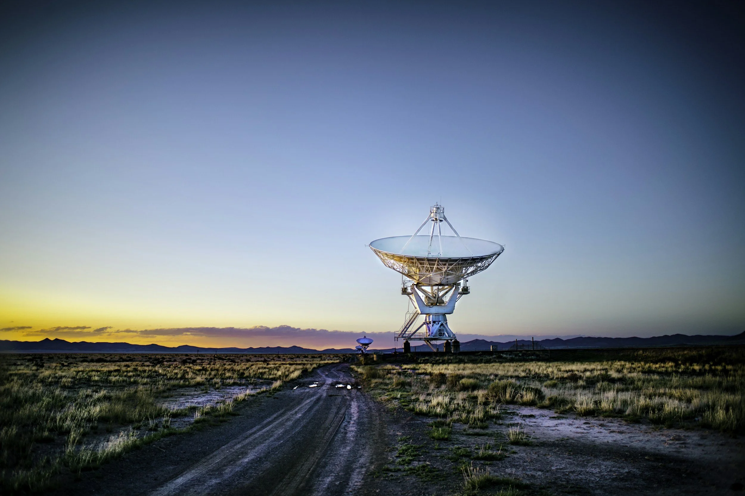
The website for the Los Alamos National Laboratory (LANL) is rich with information and resources about the lab's research, mission, business collaboration, and education. But the navigation and search features were confusing and difficult to use for both the public and lab organizations. With public outreach and increasingly critical part of the lab’s agenda, we need to rethink and overhaul the experience, structure and interactions.
Solution
Over the course of eight months, we set out to create a navigation system that was scalable, accessible, and accommodates both user needs and organizational priorities. Most importantly, the navigation system respects the wide variety of ways in which people seek out information.
-
![]()
Mercedes Martinez
UI|UX TEAM LEAD
-
![]()
Sasha Zivaljevic
WEB TEAM LEAD
-
![]()
Mia Jaeggli
PM AND LEAD UI DESIGNER
-
![]()
Jib Kiattinant
UI DESIGNER
-
![]()
Velvet Lazo
UX RESEARCHER
-
![]()
Ryan Alaya
UX RESEARCHER
-
![]()
Kendra Castle
UI DESIGNER
-
![]()
Matt Hanes
LEAD WEB DEVELPER FOR NAV
-
![]()
Zach Spangler
WEB DEVELOPER
-
![]()
Barry Low
DEVELOPMENT TECH LEAD
-
![]()
Hugh Roper
SEO TECH LEAD


Process
Discover:
Research the problem, understand user needs and behaviors, and uncover organizational needs.
Define:
Define the problem, create “How Might We’s” and hypotheses, map information seek patterns, and define accessibility and UI pattern requirements.
Develop:
Engage in cycle of ideation, testing, & prototyping
Deliver:
Collaborate with the development team to interpret designs into code and resolve unexpected accessibility issues.
Iterate:
Perform usability testing and improve the UX as required.

Process strategy
Our process model is an adaptation of the d.school’s 5 stages of design thinking and the double diamond model. The adaptation accommodated the complexity of the project and organizational processes. An example of this adaptation was broadening the “empathize” phase to “discover,” which provided a better conceptual structure to this early phase of the project. Ideate, prototype, and test. The resulting structure translated seamlessly into project planning.

Discover
Understand
The problem, information seeking behavior models
Explore
Pattern analysis, best practices
Empathize
Understand user needs, behaviors, and emotional context
Understand
Benchmark testing
NAVIGATION REDESIGN: DISCOVER
Understand: benchmark testing
We had anecdotal feedback from the internal stakeholders about what they didn’t like about the current navigation system and what the resulting information architecture limitations were. But we had very little data on how external audiences perceived or interacted with the UI.
We conducted a series of benchmark tests that measure how people interacted with the homepage and navigation and what their emotional or cognitive responses were.

Utilizing Userzoom, we gave 16 participants two tasks. The first task asked users to navigate to a 4th level subpage using the existing navigation system. The second task asked them to backtrack to the parent topic. We hoped to understand what parts of the navigation system users interacted with, how successful they were in completing their tasks, and any unknown pain points.
Post-test, our researchers extracted and collocated the data and synthesized results. The team then collectively analyzed the results to understand their impact on the new UX design. We found that the results were positive and upended some of the anecdotal assumptions that the navigation system was difficult to use. The system mostly fit with existing mental models.
Watching screen captures, however, gave us father insight into exactly how users engaged with navigation. Problem areas that surfaced were the lack of dropdown menus, placement and identification of breadcrumbs, and unfamiliar language. The recorded interactions confirmed that users mostly weren’t engaging with the secondary navigation and that information seeking isn’t a linear path, and even when seekers are given a task with linear steps.


The results of each test guided changes in the next iteration.
“My immediate thoughts on the navigation of the Los Alamos website are that it feels kind of dated and clunky/unintuitive. Not necessarily from a visual aspect, but more from a user interface perspective.”
“The words are big and I know it might not be much but being able to read easier catches my attention and I'm more likely to click on the site”
“The inability to navigate to any page on the website directly from the home page. This would be fixed by making the navigation bar at the top of the home page into a drop down sub-menu/navigation tree interface.”
“It doesn't feel intuitive to look at ‘lists’ of navigation laterally vs. vertically. I inherently want to look down, not across. There are also many options and sub-categories, it is a big confusing.”
NAVIGATION REDESIGN: DISCOVER
Empathize: survey
We extracted data from an early survey about users experience with the land.gov homepage. During that survey, navigation and design challenges surfaced. We also gained insight into users’ priorities, and interests and general willingness to engage with the website and content.
We found that visual design was an area that needed improvement. User response to the current design was divided, but in subsequent usability tests, we found recurring themes of what did or didn’t work.

Empathize: Personas
Leveraging the collective knowledge of public affairs and communications partners to build possible personas we wanted to target. Helped not only the UX/UI team understand our users but provided our stakeholders insight into the human centered designed process.
Exercise takeaways:
LANL has a large and diverse audience with a variety of interests.
Navigation needs to be easy and as intuitive as possible
Based on early surveys, our UX researchers created emotional journey maps for two target groups: students and potential employees. The journey maps were initially created for understanding user engagement with the homepage, but we found they were equally applicable to the navigation experience.

Understand: information seeking analysis
This board examines audience groups and their potential interactions with the new nav/search UI. The exercise reflects on core information seeking models & hypothesizes behaviors and needs. Those behaviors and needs are mapped to the nav/search UI of a sub-page to determine what actions user might take upon entering the page.
The relationship between audience interest/impact and the nav/search UI influence feature visibility and design.


Explore: pattern analysis, best practices


Explore: mobile design considerations

Highlights from research on mobile UI/UX design for nav/search

Empathize: journey mapping


Using information seeking models, we mapped user group goals, behaviors, and context to proposed navigation pattern.
This exercise occurred later in the design development phase but it’s an excellent example of the interactive process of design thinking.
The needs for research and further definition can become apparent at any stage.
The exercise led us to move away from an especially minimal design to richer display. We traded some elegance for functionality.
The behavioral and needs models explored are those used in information science research.
Researching navigation patterns
Evaluating navigation systems for 9+ large, complex organization
Extracting ideas for structure, hierarchy, and integration to adapt and test.

Define
How Might We’s
Statements
Hypotheses
Possibilities
Problem
Definiton
UX design strategies
Hierarchy, information seeking behavior
Interaction Flows
Traversing the website
NAVIGATION REDESIGN: Define
Problem Definition - Problem Statement
The website for the Los Alamos National Laboratory (LANL) is rich within formation and resources about the lab's research, mission, business collaboration, and education. But the navigation and search features were confusing and difficult to use for both the public and lab organizations. With public outreach and increasingly critical part of the lab’s agenda, we need to rethink and overhaul the experience, structure and interactions.
Solution
Over the course of eight months, we set out to create a navigation system that was scalable, accessible, and accommodates both user needs and organizational priorities. Most importantly, the navigation system respects the wide variety of ways in which people seek out information.
How Might We...
-
...Provide a mechanism for saving pages of interest to revise or share later?
-
...Help users keep track of where they are on the site?
-
...Help users efficiently backtrack from a topic page under a different category than where they started?
-
...Remember where a user left off & provide a history of their journey?
-
...Help users skip intro content and get to specific information like a report, article, instructions, or resource link?
-
...Make breadcrumbs more effective?
-
...Clarify for users the purpose of the 2nd navigation and increase its usefulness?
-
...Utilize progressive disclosure to address limitations of navigation real estate?
-
...Ensure the navigations are flexible and extensible as the site grows or evolves?
-
...Reduce cognitive load as a result of the content heavy site?
-
...Manage five levels of sub-pages?
-
...Avoid dumping grounds for miscellaneous links?
Hypotheses
If we highlight the primary category a user is in, they will know to click there to see where they are at in the site.
If we sub-categorize sections with many pages, this will streamline users decision making, reduce cognitive effort and reduce effort caused by scrolling through a long list of links.
Using icons and underlines will help users distinguish between a sub-category to expand and terminal links.
Users will prefer labeled icons for “search”, “menu”, and “close”.
Faceted search will help direct a user’s journey more efficiently than a simple keyword search, even if the facets are limited
The primary site nav can also be an effective sitemap if designed well.
Short one sentence description would provide a strong information scent for users looking for specific information.
A tabbed template for tropical content will reduce effort and create a mental model of page hierarchies
UX design strategy: hierarchy
Keep site hierarchy clear in user’s mind as they browse or navigate through the site.
They should understand how many levels down they are - which means they need a visual cue. Traditionally breadcrumbs. Page templates can also be used to reflect hierarchy.
Top-level categories should be familiar to users — apply common categories found on other sites.
2nd tier pages should be closely tied to their parent in topic
UX design strategy: support information seeking
Recognize that users will depart from the proscribed map and follow their own information scene based on need or motivation.
Provide cues that anchor them (I was in this category, but by following the link, I’m now in another category).
Provide an escape hatch (I don’t want to be here. I need to go back).
Understand that users may not remember where they were at two or more steps back (I saw a link that might be more helpful than the one I actually clicked on. Where was it again?) A new-ish user returning a day or week later may want to revise a topic page but may not remember how they got to that page or what the parent category was.
Anticipate that a user may not have a clearly defined idea of what they are looking for. It may be vague or casual, or they may be browsing the site in order to clarify their need.
Anticipate that a user may have a clearly defined destination or need. They could be comparing your product or service with a different org’s. They could be a frequent user who knows their destination hand has been there before.
examples: checking on a job posting or reviewing benefits again after a job interview; retrieving a report or checking to see if the report has been published; periodically searching the news site; referring content to a colleague or friend.
Interaction flow analysis
The maps revealed the potential number of clicks, decision points, and cumulative efforts in the process.
Result 1: building the navigation model to relieve cognitive overload by limiting the depth of the global menu by picking up sub-topic exploration in the secondary menu.
Result 2: simplifying the sitemap hierarchies true to discovery findings.
The need for research and further definition can become apparent at any stage.
Using information seeking models, we mapped user groups goals, behaviors, and context to proposed navigation pattern.
This exercise occurred later in the design development phase but it’s an excellent example of the iterative process of design thinking.
We created several flow charts to map out the paths users might follow to a destination
Understanding the paths users might follow to a destination.
Revealed fewer decisions points and cumulative cognitive effort.
The interaction flows were important for the development team as they evaluated how to model the new navigation and sitemap structures


Develop
Ideation
Exploring two structural patterns, layout, early visual design
Prototyping
High fidelity interactions, exploring two structural patterns, visual design
Sitemap
Restructuring the information architecture and the relationship to the navigation system
Testing
A/B, task completion, preference
Component Library
Rapid prototyping, Mesa sub-library
NAVIGATION REDESIGN: Develop
Sitemap: original
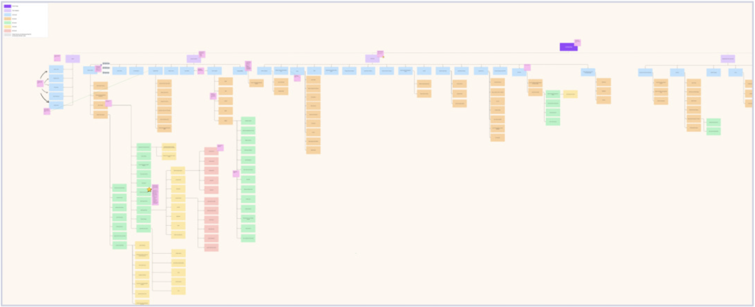
Sitemap: new

Sitemap translation to navigation

Ideation: pattern structure

Low fidelity interaction: version A


Very early in the process, we began testing complex use cases against patterns we were interested in, such as Unilever and Harvard University. These frames roughy map out a navigation flow, from homepage to 5th level sub-page. We found that there wasn’t an existing pattern that the entirety of our vision and needs
Low-fidelity exploration of structuring the information architecture in the global navigation UX
Design considerations
Usability first
Micro animations to ground users
Iconography as signifiers (arrows vs. carets)
Minimization of effort & friction
Menu hierarchy and scanning through typography and grouping
Recognition overall recall
Minimization of necessary learning curves
Ease of task completion
Accessibility (WCAG3 & screen readers)
Scalability & flexibility
Brand identity
Structure and consistency
Interactions
Ideation: iteration 1, lo-fi

We were getting closer with this design, but we would have several more rounds of smaller iterations across every element, from the top navigation bar to the links.

We decided against this design direction very quickly:
Saturated colors are visually heavy
Too much to look at (visual noise)
it would age very quickly
the designers didn’t want to look at it for the next several months
Ideation: visual design iteration

Ideation: everything, including the kitchen sink
Explore broadly and with curiosity
As we researched common navigation patterns, instead of picking one and adapting to the site to it, or visa versa, we decided to explore widely. This gave us the ability to find solutions we might not have otherwise considered.
We had two significant iterations, and each included multiple smaller interaction or design changes. The iterations and final pattern direction were determined by user testing results.
Ideation: iteration 2, horizontal pattern

Ideation: iteration 2, vertical pattern

Ideation: mobile nav, iteration 3

Prototyping: about
Our strategy was to create a high fidelity product that surfaced and addressed every possible usability and structural issue before beginning the development process. Because of the complexity of the system, the cost of backtracking in the middle of development would have been mostly costly than time spent prototyping.
The UI design team spent four weeks on the first prototypes, and then another three months iterating between tests.
Prototyping: strategy
Create a realistic product for testing and development team analysis
Use the worst case scenarios — the ones that would “break” the navigation
Create high fidelity interactions to work out pain points in:
navigation structure
task completion
interaction sequences
sitemap translation
edge cases
readability

We did the same process for mobile. We found that:
the interaction flow for two navigation models had to be adapted to mobile view
There were two possible models (we selected A)
Subsequent task verification tests confirmed our hypothesis

Prototyping: extracted site map

Before prototyping, the design team extracted more complicated test cases from the sitemap and mapped the corresponding menus.
The partial sitemap guided the structure of the prototype.
Having the visual representation:
coordinated the efforts of two designers
focused on the pages needed and their hierarchical relationship
mapped the interaction journey & surfaced potential problems

Prototyping: navigation flow (mobile)

Prototyping: horizontal nav

Prototyping: vertical nav

Testing: about
Over five months, we conducted nine tests as we iterated on designs and interactions. Each test was designed to answer an overarching question as well as smaller questions.
Interactions
Readability
Task completion
Visual design preference
Structure viability

Prototype usability and quantity control, 4 participants
Benchmark test of original navigation, 15 participants
Navigation A/B testing (horizontal vs vertical), 41 participants
Horizontal vs. vertical navigation preference test, 100 participants
Navigation click test, 73 participants
Navigation A/B test (expanded vs. condensed), 50 participants
Navigation click test (task completion), 73 participants
Second navigation preference test, 100 participants
Search icon vs. search bar preference test, 100 testers
Mobile navigation usability test, 15 testers
Iteration 2 tested a typical responsive hero pattern and secondary navigation. However, we felt that the limited screen space made the design “crunchy”. In iteration 3, we experimented with a more adaptive design that incorporated an asymmetrical hero and moved the navigation above the banner.
Usability tests confirmed our hypotheses. Users quickly completed their tasks and were pleased with the design.
Part of the navigation redesign included updating the banner layout.
We re-designed the hero to accommodate smaller screen sizes and inevitable lengthy page titles.
Created an interstitial screen to address slow loading of images because of poor connectivity.
One of the team’s most successful design desicions was placing the secondary navigation above the banner. In most UI patterns, it’s found below the banner, if at all. We hypothesized that it would be easier to find and use, and the menu title would be another anchor for the user within the sitemap. We also thought that users might generally like having it above the banner. Usability tests confirmed these hypotheses.


Testing: horizontal vs. vertical navigation


Prototyping & testing: condensed nav

Testing: A/B , expanded vs. condensed navigation
While the condensed navigation functionally and logically worked better for managing the complexity of our sitemap and organizational behavior, it didn’t improve task completion. While users seemed to prefer condensed navigation after learning how it worked, for new users, it wasn’t a good strategy to expect willingness to form a new mental map.


Prototyping: mobile navigation, secondary menu
During the develop phase, the team concurrently designed for desktop and mobile. Some of our considerations included:
Adaptive over responsive
Menu placement
Pushing content down instead of overlay to keep users anchored to the page they’re on, and
Contextual menus that open to where users are in the sitemap and highlight the page they’re on


Testing: mobile navigation usability


Component library

Deliver
Documentation
Anatomy, design justifications
Collaboration
Implementation, accessibility compliance
Final
Final designs & prototypes
Final: Global navigation

Final: Utility navigation

Documentation: Figma dev mode

Documentation: Specs
Keyboard control & readers
Animations
Endless nested navigation
LA-UR-24-25263

Los Alamos National Laboratory, an affirmative action/equal opportunity employer, is operated by Triad National Security, LLC for the National Nuclear Security Administration of U.S. Department of Energy under contract 89233218CNA000001. By approving this article, the publisher recognizes that the U.S. Government retains nonexclusive, royalty-free license to publish or reproduce the published form of this contribution, or to allow others to do so, for U.S. Government purposes. Los Alamos National Laboratory requests that the publisher identify this article as work performed under the auspices of the U.S. Department of Energy. Los Alamos National Laboratory strongly supports academic freedom and a researcher's right to publish; as an institution, however, the Laboratory does not endorse the viewpoint of a publication or guarantee its technical correctness.