

Uplift K12 Homepage Redesign
Project Summary & Background
Uplift K12 is an online platform designed to help teachers and tutors teach students math using manipulatives. It has a number of free tools, including: a virtual whiteboard where teachers can upload their own teaching materials, ready made lessons for online and offline learning, and educational math games. This platform was co-founded by teacher team Mehul and Michelle Shah, and their goal when creating this project was to help them attract more teachers to the site, and to help teachers and tutors teach math virtually.
Time: Five Weeks
Tools Used:
Figma
Optimal Workshop
Zoom
Maze.co
G Suite
My roles in this project included:
Project Manager
User Experience Researcher

Double Diamond Design Process
Thoughout this case study, I will be using the Double Diamond design system to describe the steps to create this redesign, which includes the following steps:
Discover: User behavior, and start the design process through user research, and the user’s mindset and perspective
Define: Idea generation based on research
Develop: Creating visuals and wireframes based on the ideas generated
Deliver: User testing and design iterations
Using the Double Diamond Design Process helped me organize the research information because this process puts an '“…emphasis on the ‘“divergent”’ and ‘“convergent thinking”’, where first many ideas are created (in Discover and Define), before refining and narrowing down to the best idea (Develop and Deliver). This is happening twice in this model—once to confirm the problem definition and once to create the solution” - Maciej Lipiec from uxdesign.cc
*Note: image on the right from “Double diamond: A design process model” from wiki

Discover
Initial Interview with Client
We first met with our client to talk about their website, and what aspects of the website they wanted us to redesign. They wanted us to work on their homepage (pictured below), and to redesign it so that using it would be more intuitive for teachers to use. Ultimately, they wanted to attract more teachers to sign up for a free premium (freemium account), so that they could have more users data to improve their site.

*Screenshot of Uplift K12’s home page, taken August 13th, 2022
We determined that, as the website stands, the top part of the home page and the global navigation seems to be geared towards those who were looking to purchase access to the platform (prioritizing more of the “Pricing”, “About Us”, and “Contact Us”), over the aspects that the teachers would really be interested in, like the math games shown to the right of the page.

Define
Defining the Problem
For our initial user interviews, we wanted to talk to math teachers to better understand how they educate their students in person and remotely. We also wanted to understand how they taught their students during the pandemic, what tools they used to help them through that process, and how they encouraged students to stay engaged. We determined these by asking the following questions:
How did you teach your students during Covid? Could you walk us through this process?
What are your favorite ways to teach math online, in-person, or hybrid?
What were the students’ responses using these platforms? What were some of their motivations and frustrations?
What are the barriers that you’ve faced in motivating students to complete tasks?
From these questions, we were able to define what it was teachers were looking for when considering using a website:
Instructors need a platform that can help their students engage with the learning material, as well as with each other in order to have a successful lesson plan.
Instructors require a platform to be user-friendly, that is easy to explore right away, while also being cost effective.
Access to technology can be a huge barrier for some students. Instructors described how some of their students didn’t have access to up to date machines, had unstable internet, or sometimes both. This really affected their ability to learn.
Both instructors and students needed a variety of different online tools to accommodate both the instructors teaching style, as well as their student’s learning styles.
From these insights, we created some key questions to address when creating our first prototype:
“How might we show that Uplift K12 is an intuitive to use whiteboard platform?”
“How might we highlight the unique lessons, games, and side-by-side teaching tool Uplift K12 provides?”
“How might we encourage users to sign up for the “freemium” account?

Develop
Hypothesis
Our stakeholder informed us that Uplift K12’s home page should prioritize showcasing interactive elements in order to make the more accessible to users. We should do this in order to encourage users to try out the tools the platform provides, and hopefully this will encourage them to sign up for the “freemium” service, no matter their comfort level with technology.
Design
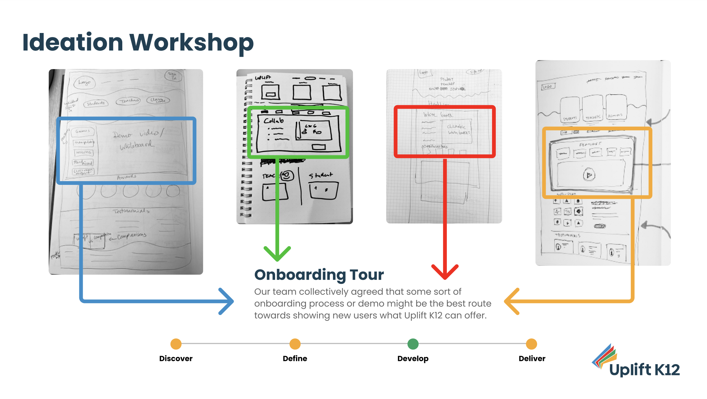
Ideation Workshop- Our team started to brainstorm some potential UI designs through an ideation workshop. We all agreed- and thought that our homepage redesign needed to feature some sort of onboarding tour might be the best solution to get new users to use and sign up for Uplift K12.
Mid-Fi Prototype - We used our designs and combinded them to create a mid-fidelity wireframe and used it as a prototype. We designed the global navigation to link directly to the most used tools of Uplift K12, being the whiteboard tool, pre-made lessons, and math games.

Here are some of the changes we implemented in our mid-fidelity prototype:
We made sure that the global navigation had sections that the teachers would want to interact with: the whiteboard, lessons, and games. We also wanted to put the “Sign In” and “Sign Up” buttons are at the top right, so it would be easy for users to find.
We put a section where Students, Teachers, and Admins could sign in. We wanted to make it easy for teachers and students specifically to sign in, so that they could get into interacting with the platform as soon as possible.
We put the demos right beneath the login section, and throughout the rest of the website, so that teachers could explore more of the features that Uplift K12 had to offer before signing up for the freemium account.
Mid-Fi Usability Testing- We conducted virtual usability tests through Zoom with six (6) total users. Our group then took their feedback and created an affinity map, and came up with four takeaways:
Almost none of the users we tested scrolled through the home page.
The users were very vocal about not wanting to scroll for any platform information.
Teachers are always pressed for time. Most of them don’t have the luxury to learn in depth about a platform before using it.
Most of our users wanted to start using the platform right away, rather than sitting through a demo first.
Quotes From Our Usability Tests
“I don’t really like to scroll down for any website. It’s a turn off for me!”
“I just know teachers are limited on time and overworked already- finding info easily is imperative.”
“I just want to dive right into the tools without reading the instructions first.”

Deliver
Redesigned Global Navigation
Original Global Navigation: The previous version of the navigation focused on appealing to administrators and investors, not teachers.
High Fidelity Global Navigation: Our redesign was now designed to appeal to teachers, only showing what they would be interested in interacting with.


Multiple Access Points to Whiteboard: We added multiple ways for users to access the whiteboard, making it more accessible for instructors who didn’t have time to scroll through the site. We also added a “Get Started” button in our demo to ensure users can get to the whiteboard almost anywhere on the homepage.
High Fidelity Prototype
Ultimately, we made the following changes based on our usability testing:
We added a “Whiteboard” section in the global navigation, and added a drop down menu for quick access to the whiteboard tool and also gives the user an option to learn more about the tool as well.
We also added a “Lessons” and “Games” section to give users the ability to view what’s available for them to interact with.
Most of the tours and demos that were previously featured in the mid-fidelity prototype have now been placed a the top of the homepage, so that users don’t have to scroll to view it.
Pop up modals are now integrated into the top navigation for ease of access.
The lessons and games now have descriptions with animations that illustrate to users what each feature does before users select to use them.
Conclusion & Reflection
Based on our research findings, we redesigned the Uplift K12 homepage to make all of the tools on the platform more accessible at the top of the homepage, so that users no longer have to scroll. This in turn made the platform more intuitive to use for teachers who are limited on time, and allows them to determine if Uplift K12 would help them teach their math curriculum.
It was such a pleasure interviewing teachers and learning about their needs. I found it quite surprising that they are always limited on time (although now, reflecting on it this totally makes sense), and because of this, they don’t always have the time to learn in-depth about a new product before using it.
One thing that I was not surprised by - was how much each teacher really loved their job, and cared deeply about their students. This dedication persevered through the pandemic, and teachers would often try to utilize different platforms to make teaching remotely easier.
-
From a design perspective, we knew what the client wanted was a better home page that would attract more teachers to sign up for Uplift K12’s freemium account. They thought the best way to do this was to make the demo section of the website better. Upon during some usability testing with the mid-fidelity prototype, we knew that this wasn’t the case, and had to redesign the entire information architecture instead. This is such a valuable lesson in the importance of conducting user research, and how sometimes what the client wants, isn’t what the users need.
-
Run usability tests using the high-fidelity prototype to see if teachers would be more likely to sign up for Uplift K12’s freemium account.
Determine if the redesign of the global navigation addresses the users concerns of having all the information up top
Hand over the high fidelity prototype to the development team
Interview more users about the redesign and consider their feedback when trying to determine if another redesign is needed
-
This was my first UX project where I had the opportunity to work with a client. It was such a valuable lesson in learning how to advocate for the users needs, while also trying to meet the expectations of our client - even though the users needs didn’t align with what the client initially thought the home page needed.
This was also my second time working with a group a UX designers, and the second time I acted as team lead and project manager. I find myself humbled by the hard work each of my team members put into this project, and I know they will be sucessful UX designers in the future.
If I had the opportunity to work on this project again, I would definitely take more time in conducting a usability test for the high- fidelity prototype. I would love to see if this redesign really leads users to use the product - then sign up for the freemium account. Overall, this was a very rewarding experience. I was very proud of our UX Design team, and thrilled that our client absolutely loved the final product.
A Special Thanks
Thanks to our clients and creators of Uplift K12, Mehul and Michelle Shah. It’s been such an honor, and privilege to work with you both on this project. We are delighted that both of you liked our final product, and I hope I get an opportunity to work with you in the future.
I’d also like to thank my team mates, UX Designers Marc Ravelo, Chieni McCullough, Branden Turner, and Jordan Friedley. You all are the best team (and friends) anyone could have asked for. I wish you all the best in your future careers as UX Designers, and I sincerely hope we can work together in the future.